5 Tips to the Best Paint Color: Blue Kitchen Makeover Before & After
Welcome to my kitchen!
Ladies,
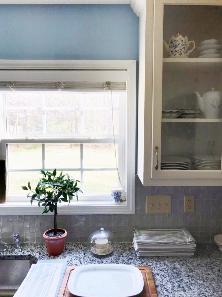
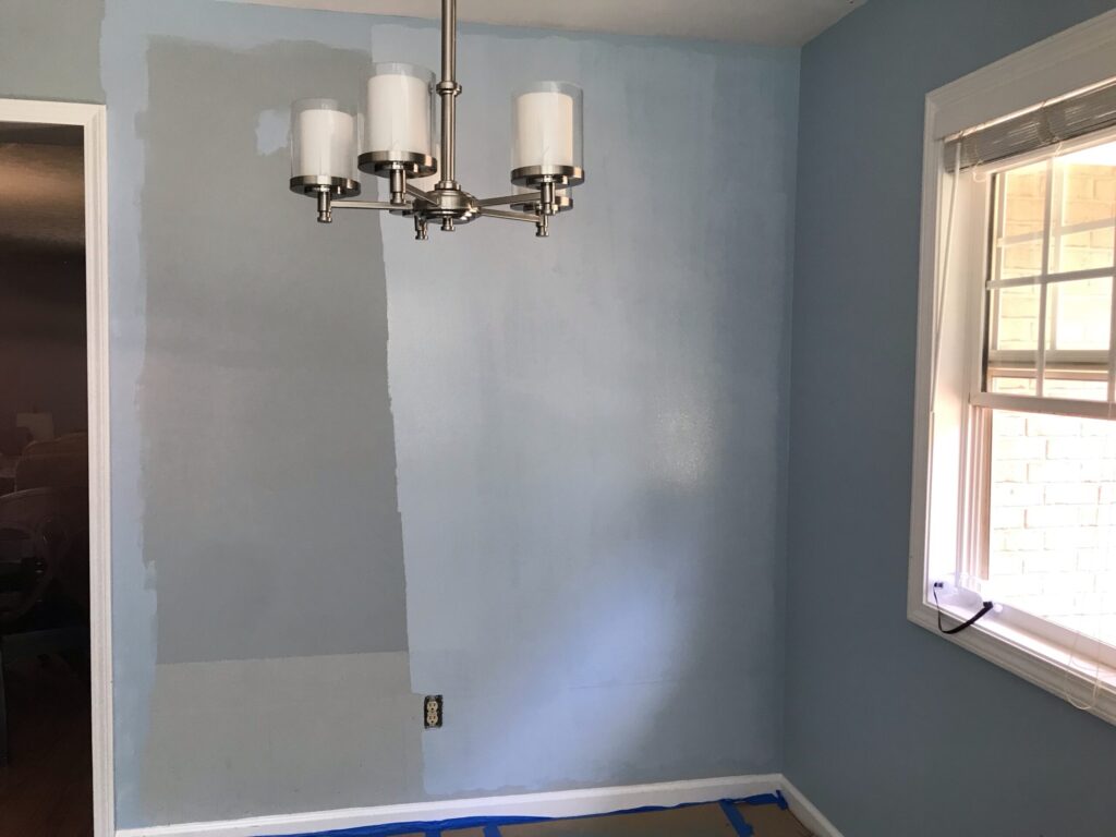
My rental house kitchen was trying to be a cheerful and chic “French blue”, but the dusty grey undertone of the before wall color was holding it hostage from its goal! I was off to buy paint, yet again. As a rental kitchen, I was not pouring money into anything else, so I needed to enhance what was here: black and grey granite countertop, light green tile backsplash, cream white cabinets, and warm “wood” vinyl plank floors. While I show you the before and after kitchen makeover, here are some unique tips on how to choose a paint color that I came up with after all of my years of moving across the country as a nomadic wife, decorating and re-decorating home after home.
Some of these tips are my own observations, the interior design musings of a homemaker wife. Some are from professional interior designers that I have learned from along the way.
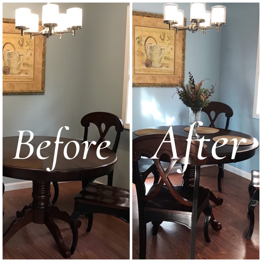
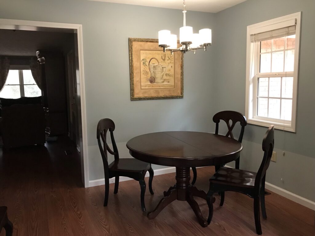
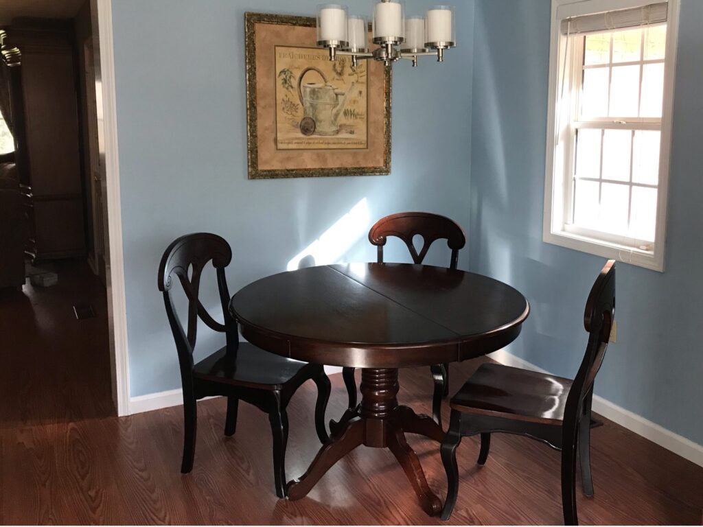
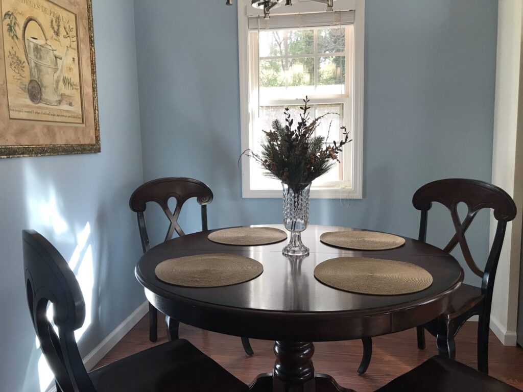
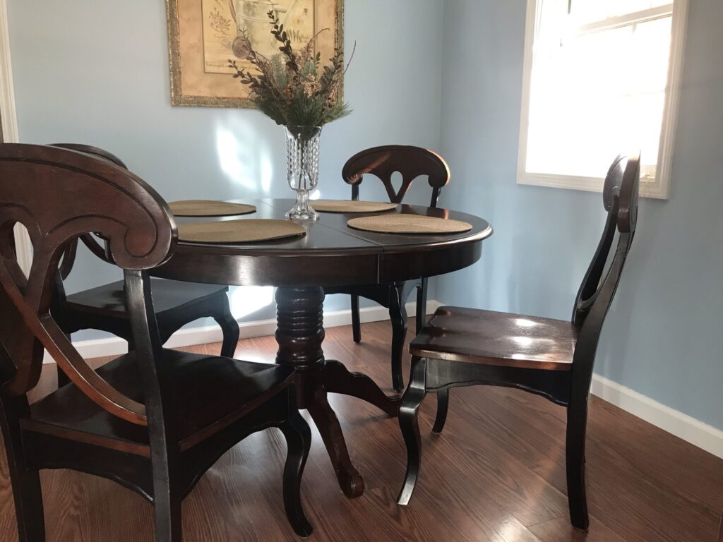
The new blue paint, what I call a “French blue” makes the furniture and the wood floor look better! Look how dull everything looked against that gray blue color. It really pops against the new blue.
TIP #1 Choose the Best Paint Colors by the Outdoor Palette
This is my own tip, that I have never heard anyone else mention.
I have lived in many different states, from mountainous woodsy places, to flat plains, to rolling wheat fields, to gray and rainy, to hot and sunny, to sub-tropical climates. I have seen a lot of decorating across the states. And by no means am I saying do not paint bold colors, or vibrant colors, but one key to buying the right colorful paint, is to choose a paint color reminiscent of colors outdoors in that particular natural environment.
Tropical turquoise looks natural in a setting like Florida where the water is that color, but turquoise looks intrusive in a woodsy place where nothing, not even the water outdoors is that color but rather a dark blue or green. There is good contrast and bad contrast and that is a bad contrast because that bright color is not a natural bright color found in that environment.
No matter how much you want to infuse a certain color into the interior, paint can look out of place based on where you live. Interior decor looks best when it makes sense with the natural exterior.
Every color belongs in every place, if it’s in the right shade and tone of that color that makes it look appropriate in that setting.
Like I said above, bright turquoise mint green doesn’t work as a wall color in a woodsy environment. But you could use a different light green that has gray mixed in, which would be like a seafoam green. You could use teal, which is a vibrant blue green with a similar bold look in the same color family but more similar to the outdoor environment of a woodsy place. There are bold and vibrant colors that look beautiful in a woodsy environment such as emerald green for instance. It is still the same rich vibrant look but in a color that works in that environment.
There are vibrant and rich colors in all natural environments in varying intensities and tones. You can choose indoor paint colors by pulling from the most vibrant colors outdoors to look appropriate in that setting.
Vibrant, rich, or deep paint colors work best when they mimic the vibrant, rich, or deep colors of that particular outdoor environment.
A sky-blue color is a fairly universal paint color in any environment since this sky color can be seen everywhere. In places with dreary weather, this color is a way to infuse a sunny day inside your house and cheer up the environment, but it will appear very vibrant in comparison to the usual gray skies outdoors. In a sunny climate, it is simply continuing the sky color indoors.
TIP #2 Clean & Muddy Color Tones
This tip is not my own. Go read stonegableblog.com for more insight on color, she explains it so well!
Professional designers call this blue a “clean” color, having very little gray or black, it means the tone is bright and vibrant, not muted at all. The designer rule is that clean colors go with other clean colors. Muted or “muddy” colors, ones with gray that make them duller, go with other muddy colors. The rule is to keep clean colors with clean and muddy colors with muddy. However, mixing clean tones with muddy tones is a good thing as they play off of each other well in the right amounts. The ratio matters when mixing clean and muddy colors. Small amounts of muddy tones calm clean tones making them look less bright. Small amounts of clean tones to a muddy toned palette can keep it from feeling too dull.
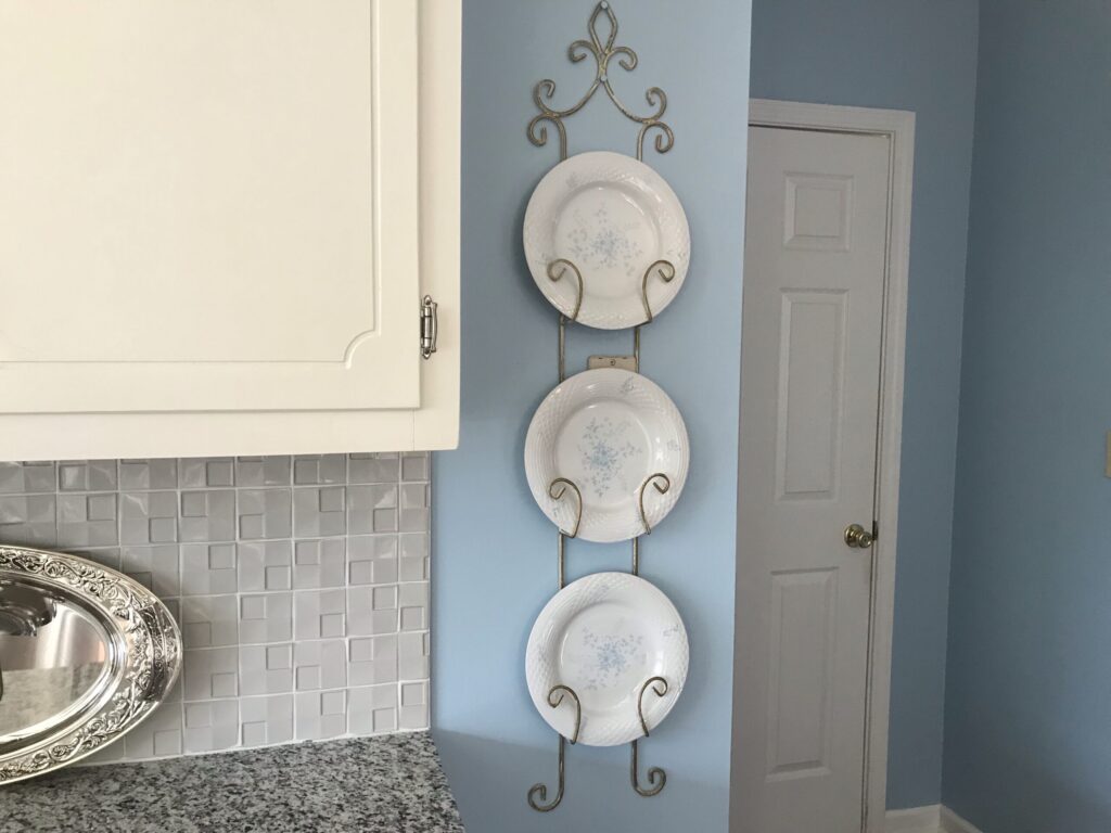
The tile backsplash is a light green with a lot of gray in it. That makes the tone of the tile color “muddy”, because the color of the green is muted by the gray and black in it. This is the tone of the color. The blue painted walls have a “clean” tone with no gray or black muting it down. Next to the muted light green it is a distinct clean/muddy combination. The backsplash isn’t exactly a small amount of wall space so I’m pushing the envelope here, because if you have too much of muddy with clean and not just a small amount, you risk them fighting each other (or clashing). Even though this muddy green tile takes up a significant amount of space, I think it still works to tone down the clean blue color without looking too opposed to it. The design principles are not hard fast rules, they are a guide to getting combinations to look harmonious.
TIP #3 Combining Cool Colors with Warm Colors
There is another principle of combining cool colors (the blue paint) with warm colors, like the brown wood floors and the dining set here. These wood tones are very warm not gray at all. The rule of design when mixing cool with warm colors is to stick with 80% of one and 20% of the other. My kitchen has the blue walls, the green tile backsplash, and black and gray granite countertop. Those are all cool colors. The cabinets are ivory off white with a yellow undertone, so they are considered a warm undertone. So the floors, cabinets and furniture are all warm colors. I think my room is split 50/50 with warm and cool. I think it works. Maybe this is an exception to the rule…maybe I don’t even believe in this rule! But this is a tip to know when choosing paint color, it helps you analyze the color palette.
TIP #4 How to Know if a Paint Color is For You
This is another one of my own tips.
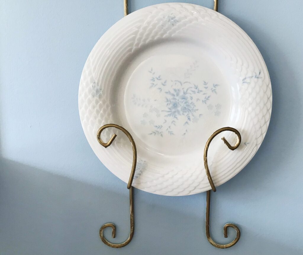
Do you already own anything in the wall color that you are considering? Do you like the color enough to have it in items like dishes, rugs, throw pillows, or wall art? If yes, then you know the wall color is a good fit for your taste. I love this vibrant light blue color in dishes, kitchen towels, rugs, etc. so, I knew that I admired this color blue enough to want it in my room in the first place and to like it on a large scale. If you do not own the color in anything, seriously question whether putting that color on your entire wall is a good fit for your taste. If you love a color, chances are it’s already in your decor. Paint with colors that you are naturally drawn to, that make you feel serene, or happy, not by trends.
TIP #5 Make a Room Look Professionally Done
This is a tip from a professional interior designer.
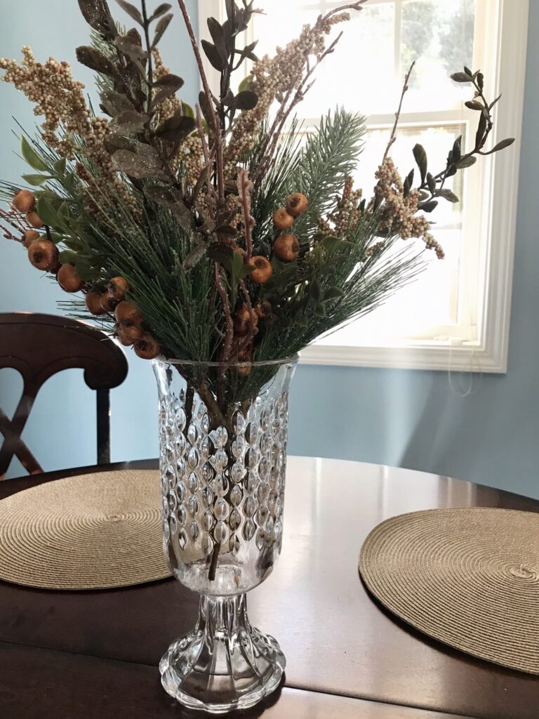
You have to make sense of the wall color in the decor. When the color of the wall is the only place that color exists in the room, it can look out of place. It is vital to repeat your wall color in your decorating so that the room is cohesive. I knew I would be repeating this color in decor because I already owned decor in this color, which is also how I knew I liked this color! But plan to use other colors as well, ones that dance beautifully with the wall color. When choosing a paint color, consider what other colors are complimentary to that color. If you do not like any complimentary colors that go well with the wall color, then it will be next to impossible to decorate that room. Make sure you repeat the wall color in the decor and use other complimentary colors to the wall color throughout the room.
Lastly, People see Color not Brands
No one knows the brand of paint you use. If there is a specific color that is only available in a specific brand, then buy a brand name. But on my tight budget, I use Glidden. $23 per gallon for paint+primer and it works great. This is the color “Sonata”. There is a time and place to buy high quality paint. This was not one of those times.
Thank you for stopping by my kitchen and I hope you stop by again for more home decor and design fun.
Until next time!
whateverlovely.com
COUNTRY LIVING – FASHION -HOME
Barbie
"Whatever is true, whatever is honorable, whatever is just, whatever is pure, whatever is lovely, whatever is commendable, if there is any excellence, if there is anything worthy of praise think about these things." Philippians 4:8 Blogging about country living, homemaking, fashion and decor tips with a penchant for all things princessy, Barbie


You May Also Like
The Best Decorating Advice & Tips to Your Authentic Style
5 of The Best Luxury Decor at Walmart